BACK
TO THE
ROUTES
REBRAND
Taking the company back to its routes and creating an aesthetic that should have been outlined from its creation; bold, professional with a clear identity.
Client
84 World
Year
2024
When I originally joined 84 World back in 2022, I was tasked with reverse engineering their website design in order to make their Brand Guidelines. Unfortunately, the way it was branded felt limiting and without a strong sense of identity.
After a couple years of working with this branding, attempting to implement new designs and themes within the guideline framework, a discussion was finally had about rebranding the company. Creating a stronger identity with a new website being the key focus.
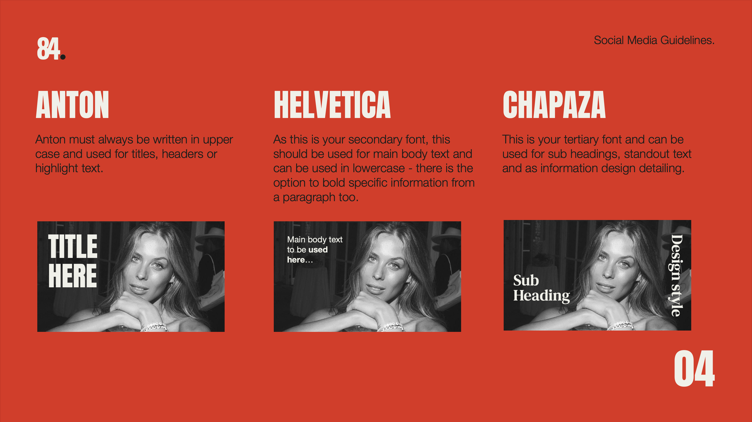
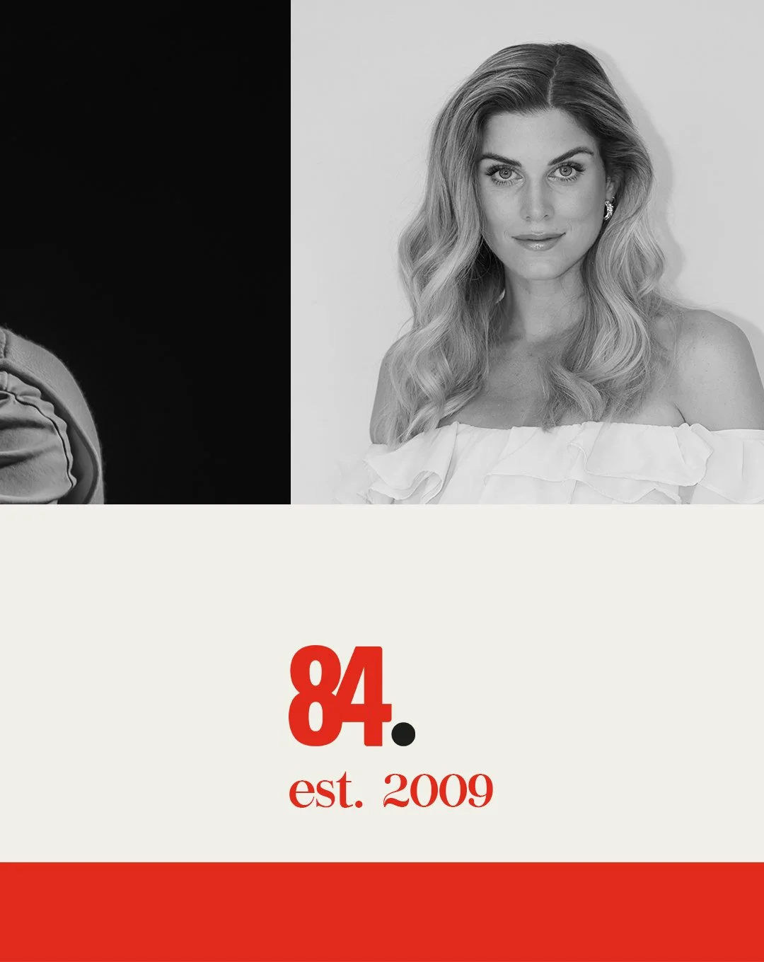
The agreed upon proposal which I designed and developed into the branding below, stemmed from the original logo design for the company back in 2011 (A Black 84 with Red Dot). I felt this is the way the company should have been branded from the offset, with an extensive Brand World showcasing how the Colour Scheme and editorials could be used.


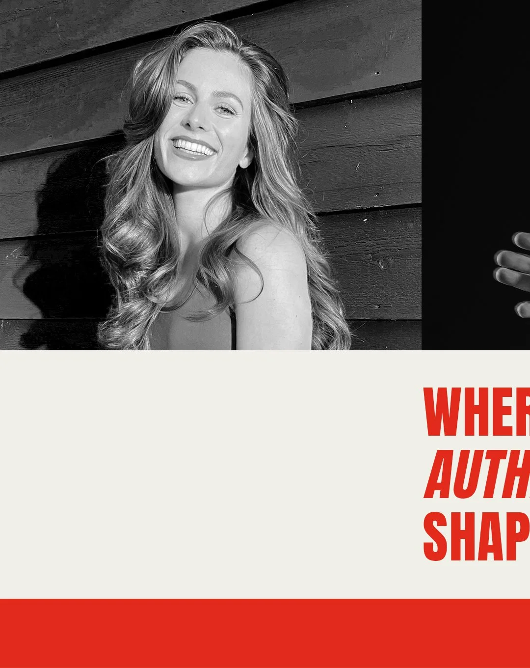
Rebranded assets
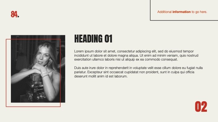
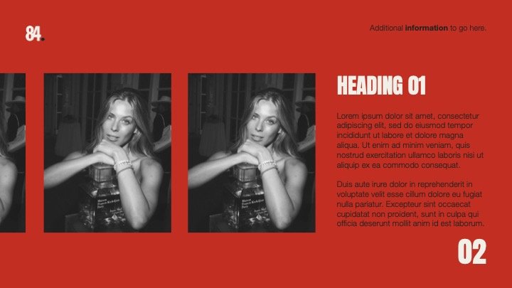
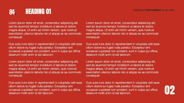
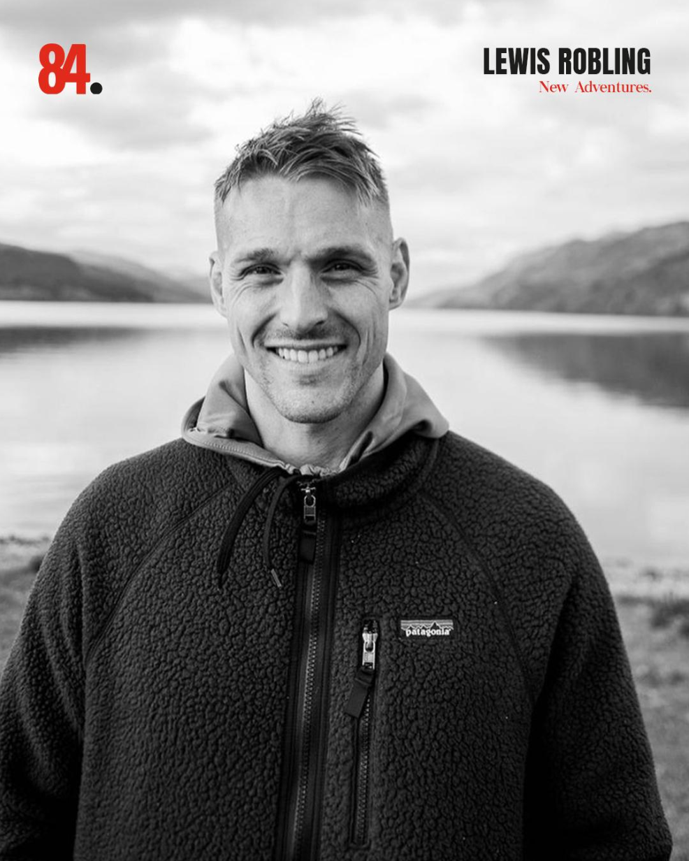
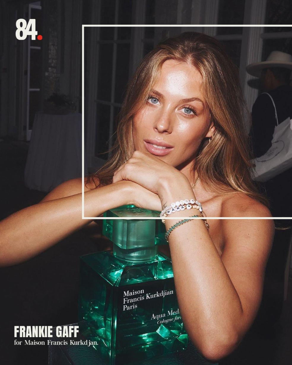
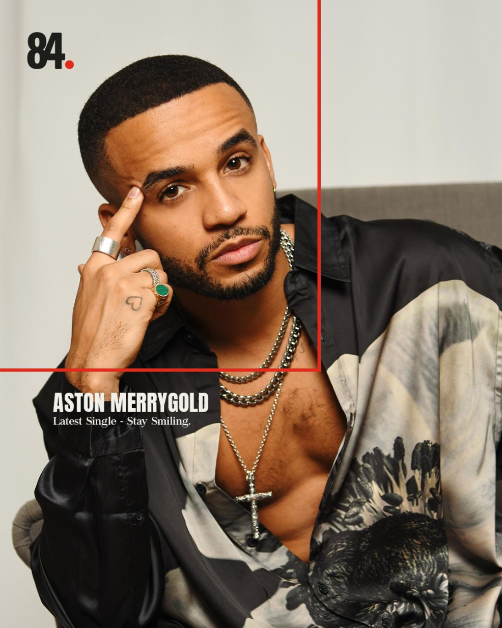
Below are a selection of assets across the relevant social channels showcasing the new stylisation. Below these are are two decks I created internally for the team. One is a presentation explaining the new social design and how assets and positioning should be thought about and the second is a presentation builder for internal and external communications.
INSTAGRAM rebrand announcement

INSTAGRAM Grid stylisation
Linked in
stylisation


Website banner animation